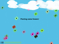
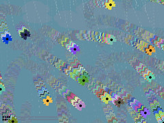
I wrote a program in processing that reacts to how vigorously you shake an accelerometer.
The arduino communicates the sensor's readings through a serial connection to processing. I used a smoothing function, in my arduino code, to get clean values from the accelerometer, which tends to give very eradict readings otherwise.
When you first open up the processing app, it is a calm, blue day.
If you make it so that the sensor's readings match up on the x- and y-axis, you plant flowers on the screen.
Slightly shaking it causes the blooms to blow...
Quickly shaking it causes a rain storm (and all the flowers blow away)
Leaving the sensor alone for 10 seconds let's the storm go away, returning you to a clear day.
Download Processing and Arduino code
Showing posts with label sensor workshop. Show all posts
Showing posts with label sensor workshop. Show all posts
Monday, April 23, 2007


Monday, April 09, 2007
American Museum of Natural History
My Sensor Workshop class went by the American Museum of Natural History last week, and got to take a look at their newest permanent exhibit, the Hall of Human Origins. We also got a special behind-the-scenes peek at the workshops where they construct the dioramas on display in the museum.
I was particularly interested in seeing this exhibit, since my old academic roots lie in human evolution and primate sociobiology. Yes, I was a physical anthropology major as an undergrad before switching to design + art, and I still have a strong interest in the going-ons of this field.
Anyways, our task for the day was to think about improvements that could be made to the exhibit, as far as interaction design go. In other words, how could we make the exhibit more engaging, inviting, and clearer to understand for the visitors, all of whom come from many age groups, cultural backgrounds, and levels of education.
There was one display in particular which I thought was on the right track, but just didn't quite make it to the finish line, in terms of being easy to use and understand. It was a large back-lit illustrated map of the world, mounted against one wall, with a second display set in front of it, divided into segments corresponding to different regions of the world. Each of these segments had a description of the region it represented, complete with a touch sensitive, die-cut button that activated the faint tracing of a line on the mounted map, representing immigration into those regions. Each region's line had its own color to help it stand out from the others. This, however, was not enough to get everything across clearly.
The immediate problems with this display were the following:
- After touching a region's button (operative word is 'touching', not 'pushing'... something like a qprox touch sensor was used here), a colored line of very diffuse light would begin to slowly lurch its way from one point on the map to another. The light was in fact so diffuse, it was nearly impossible to spot for all but one region.
- The line tracing took place very slowly, with a significant delay after touching a region's button. It felt as though it was broken at times, like nothing was going to ever happen.
- The button itself was problematic. There was really no good reason to have a touch button in place of a traditional push button. There is something very satisfying and final about actually getting to push a button down, and hear it click back up. It affirms for you that an action has taken place, and will (hopefully) result in some kind of action. When I tried to push the buttons installed for this display, it felt incomplete, and very unsatisfying to have this huge cut-out shape unable to be pushed down.
So right away, it'd be great if at least the lines were much brighter and clearer, and if the buttons had a little more tactile feedback for the user. Also, obviously, the time between activating the button and actually seeing something happen on the map, should be shortened.
Wednesday, February 14, 2007
Datasheet Report: 8-Bit Shift Register

img pulled off of sparkfun electronics
Today I'm looking at the datasheet of a Texas Instruments SN74HC595 8-bit shift register with 3-state output registers.
Download Datasheet
Features
* 8-Bit Serial-In, Parallel-Out Shift
* Voltage operating range of 2V - 6V
* Low power consumption (80µA)
* Low input current of 1 µA max.
* High-Current 3-State outputs which can drive up to 15 LSTTL loads
(btw, LSTTL stands for "Low-power Schottky" Transistor to Transistor Logic, TTL being a kind of solid state logic)
* Shift register has direct clear
The below diagram shows the pin mappings for this chip, depending on which package you are using:

What does it do?
So, what does an 8-bit shift register do? It's commonly used to increase the output capacity of a microcontroller. Data is shifted down along 8 pins (or more, depending on what kind of shift register you get), and passed out through each pin, expanding the number of possible output pins available to your microcontroller. This is also called 'multiplexing' a signal.
How to Connect
At a minimum, three pins of your microcontroller are required to connect to the 8-bit shift register: one for the clear pin (SRCLR), one for the clock pin (which controls the frequency at which signals are transmitted) (RCLK and SRCLK: these can be connected together or independently), and one for the data you are looking to send through the register, i.e., the input pin (OE).
The clear pin, when set to low, clears all the pins on the shift register of their current state (high/low), and when set to high, allows the pins to receive input from your microcontroller. Because this shift register has a D-type storage register built into it, this means that once you set the pins high or low, they retain that state. Therefore, the clear pin is necessary in order to literally 'clear' the current states of the shift register pins.
In order to get the input signals into the shift register, you must PWM (pulse width modulate) a clock signal for 8 cycles, or however many bits your shift register is designed to carry. Most shift registers use 'synchronus' communication, meaning that the rate at which signals are sent to the IC, rely on the clock signal of the microcontroller, which is transmitted via the RCLK and SRCLK pins.

The shift and storage registers each have their own clocks. When connected together, the shift register is always one clock pulse ahead of the storage register. I'm guessing this is so to keep the data moving ahead in order to make room for the next signal coming down the pipe.
Saturday, February 10, 2007
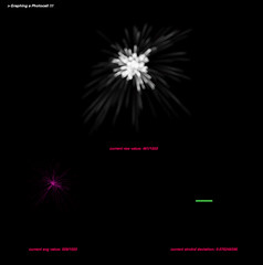
Sensors and Time
I built a little visualisation tool, using processing, for graphing sensor activity. In this case, I was specifically looking at a photocell. The nature of the data being sensed, in this case, light, informed the way I chose to display the data.
There are three parameters being graphed here: raw data, averaged readings, and the standard deviation between readings.
The circuit is really simple. It's just a photocell hooked up to an arduino board analog in pin. My arduino board communicates serially to my processing app, which then displays the data accordingly.
Download my code here: arduino | processing
Subscribe to:
Posts (Atom)